
[](https://plnkr.co/edit/d10SwC?p=preview)
# AngularJS TableView ([example])
[AngularJS]: https://angularjs.org/
[ng-template]: https://docs.angularjs.org/api/ng/directive/script
[example]: https://plnkr.co/edit/d10SwC?p=preview
[npm]: https://www.npmjs.com/package/angular.tableview
[Bower]: https://bower.io/search/?q=angular.tableview
[request]: #request
[response]: #response
[provider]: #provider
[configuration]: #configuration
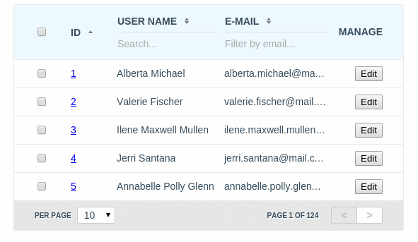
A data grid for [AngularJS].
* Native [AngularJS] implementation, no jQuery
* Fluid [configuration] allows you to use only the features you need (sortable, filterable, selectable, editable, ...)
* Complete customisation by using [AngularJS] templates (aka. [ng-template]) and directive [configuration].
## Table of contents
1. [Quick Start](#start)
* [Integration](#start)
* [Directive attributes](#attributes)
* [Minimal application example](#minimal-example)
2. [Reference API](#API)
* [Configuration object](#configuration)
* [Configuration example](#configuration-example)
* [The $tableViewProvider](#$tableViewProvider)
* [Request object](#request)
* [Request example](#request-example)
* [Response object](#response)
* [Response example](#response-example)
* [CSS classes](#css)
3. [Complete online usage example](https://rawgit.com/w3core/AngularJS-TableView/master/example/index.html)
## Quick Start
**Dependencies**
* No dependencies
### Downloading TableView using [npm]
AngularJS TableView is registered as a package on [npm]. You can install the latest version of TableView with the command:
```
npm install angular.tableview
```
This will install TableView in the `node_modules` directory. Within `node_modules/angular.tableview/dist/` you will find a compressed release files.
### Downloading TableView using [Bower]
AngularJS TableView is also registered as a package with [Bower]. You can install the latest version of TableView with the command:
```
bower install angular.tableview
```
This will install TableView to Bower's install directory, the default being `bower_components`. Within `bower_components/angular.tableview/dist/` you will find a compressed release files.
Make sure to embed it in your HTML document:
```html
```
Turn on `tableview` module in the your awesome `application`:
```javascript
var application = angular.module("app", ["tableview"]);
```
Pass grid [configuration] via `tableview` attribute:
```html
```
In the case if you need to completely change default template of `tableview` directive, you can define path to your template via `tableview-template-url` attribute:
```html
```
Directive attributes:
| Attribute | Type | Details |
|:-----------------------|:-----------------:|:----------------------------------------------|
| tableview | `required` Object | TableView instance [configuration] object |
| tableview-theme | `optional` String | The name of TableView theme to be used here |
| tableview-template-url | `optional` String | Path to your custom template of the TableView |
All that you needed is to define in your controller [configuration] and data [provider] function
that receives current [request] object and callback function as arguments and should provide
[response] object for the current [request] to the instance of TableView via calling of callback
function by passing [response] object as argument.
**Minimal application example:**
`[index.html]`
```html
AngularJS TableView Example
```
`[script.js]`
```javascript
angular
.module("app", ["tableview"]);
.controller("Ctrl", function ($scope) {
$scope.configuration = {
columns: [
{field: "id"},
{field: "name", title:"Name"},
{field: "email", title:"Email"}
],
provider: provider
};
function provider (request, callback) {
asyncRequestToServer (request, function (response) {
callback(response);
});
}
});
```
## Reference API
**`REQUEST` object structure**
All properties of the `REQUEST` object are `[optional]`
| Property | Type | Details |
|:-----------------|:-----------------:|:--------------------------------------------------------------------------------------------------------------------------|
| limit | Integer | How many entries should to be requested from the server |
| page | Integer | The page number, that should to be requested from the server |
| like | Object | An object that describes filtering by fields, where name of property is field name and value of property is search string |
| order | Array | An array of objects that describes fields with sorting order by which should be sorted result entries |
| order[x] | Object | An object that describes sorting order by the field |
| order[x].field | String | The property that defines field name by which should to be sorted result entries |
| order[x].sorting | String `ASC|DESC` | The property that defines sorting order for the field name by which should to be sorted result entries (`ASC` or `DESC`) |
Request object example:
```javascript
var request = {
limit: 10,
page: 1,
order: [
{field:"id", sorting:"ASC"},
{field:"name", sorting:"DESC"},
{field:"email", sorting:"DESC"},
// ...
],
like: {
"name": "John",
"email": "smith@",
// ...
}
};
```
**`RESPONSE` object structure**
| Property | Type | Details |
|:---------|:-------:|:--------------------------------------------------------------------------------------------------------------------------------------------------|
| limit | Integer | Limit that was returned from the server to show results in the TableView. Used for correction of the mapping |
| page | Integer | The page number, that was returned from the server. Used for correction of the mapping when it needed (when filters has been applied for example) |
| amount | Integer | Summary amount of the records that available by the sent [request]. Used for calculation and building of the pager section |
| rows | Array | An array of objects (entries) to display considering to [request] |
Response object example:
```javascript
var response = {
limit: 10,
page: 1,
amount: 12345,
rows: [
{ "id":123 , "name":"John", "email":"smith@gmail.com" },
// {...}
]
};
```
**`CONFIGURATION` object structure**
All properties of the `CONFIGURATION` object except `columns` and [provider] are `[optional]`
| Property | Type | Details |
|:----------------------------------|:-------------------------:|:--------------------------------------------------------------------------------------------------------------------------------------------------------------------------------------------------------------------------------------------------------------|
| provider | `required` Function | Accepted arguments: `(request, callback)`. The function that receives current [request] object and callback function as arguments and should provide [response] object for the current [request] to the instance of TableView via calling of callback function by passing [response] object as argument |
| columns | `required` Array | Array of `column` Objects with definitions of visible columns |
| column.field | `optional` String | The name of field in DB that can be used for the sorting and filtering logic. In additional it creates CSS class "column-{{field_name}}" that can be used for UI customisation |
| column.name | `optional` String | An unique name of the field that can be used for UI customisation from CSS via using of CSS class "column-{{name}}" when `field` is not defined |
| column.title | `optional` String | The column title |
| column.placeholder | `optional` String | Placeholder for the filter input. Default: "Search..." |
| column.sortable | `optional` Boolean | Enables sorting logic for the column. Requires `field` property. In additional it creates CSS classes "sortable" and "sortable-{{asc|desc}}" that can be used for UI customisation |
| column.filterable | `optional` Boolean | Enables filtering logic for the column. Requires "field" property. In additional it creates CSS class "filterable" that can be used for UI customisation |
| column.editable | `optional` Object,Boolean | Enables editable logic for the column. Requires "field" property. In additional it creates CSS class "editable" that can be used for UI customisation |
| column.editable.type | `optional` String | Available values: `text`, `textarea`. Default: `text`. The type of HTML tag (`input` or `textarea`) that will be used in edition mode |
| column.editable.validate | `optional` Function | Accepted arguments: `(column, row, field, value)`. Should return an object: `{ status: Boolean, message: String }`. The function that will be used for validation of the field before changing of the model in edition mode. |
| column.editable.change | `optional` Function | Accepted arguments: `(column, row, field, value)`. The function that can be used for saving of changed fields on the server. |
| column.template | `optional` Object | The list of templates that should to be replaced for the current column cell by using custom templates (see AngularJS [ng-template]). The name of property is reserved word, that used to define replacement area in TableView template file. |
| column.template["head.cell"] | `optional` String | An identifier of template to be used as cell of table header |
| column.template["body.cell"] | `optional` String | An identifier of template to be used as cell of table body |
| column.template["body.cell.edit"] | `optional` String | An identifier of template to be used as cell of table body in edition (see: editable) mode |
| column.template["foot.cell"] | `optional` String | An identifier of template to be used as cell of table footer. Requires of `template["foot"]` generic template implementation. |
| template | `optional` Object | The list of templates that should to be replaced by using custom templates (see AngularJS [ng-template]). The name of property is reserved word, that used to define replacement area in TableView template file |
| template["head.cell"] | `optional` String | An identifier of the generic template to be used as cell of table header |
| template["head.cell.select"] | `optional` String | An identifier of the template that contains implementation of toggle selection logic for all rows on the page when selectable logic used |
| template["body.cell"] | `optional` String | An identifier of the generic template to be used as cell of table body |
| template["body.cell.edit"] | `optional` String | An identifier of the generic template to be used as cell of table body in edition (see: editable) mode |
| template["body.cell.select"] | `optional` String | An identifier of the template that contains implementation of toggle selection logic for the current row when selectable logic used |
| template["foot"] | `optional` String | An identifier of the generic template to be used as table header. Not implemented by default |
| template["pager"] | `optional` String | An identifier of the generic template to be used as pager section of the table |
| template["pager.limit"] | `optional` String | An identifier of the generic template to be used as pager limit section of the pager |
| template["pager.controls"] | `optional` String | An identifier of the generic template to be used as pager limit controls section of the pager |
| template["pager.selection"] | `optional` String | An identifier of the generic template to be used as selection controls section when `selectableBy` mode enabled |
| [request] | `optional` Object | Initial custom [request] object that can be used to provide stored [request] from previous user session |
| multisorting | `optional` Boolean | Turns on multicolumns sorting logic |
| selectableBy | `optional` String | Turns on rows selection logic by primary key field |
| scrollable | `optional` Object | Turns on scrollable logic for the table area and allows to provide custom styles for scrollable area such as `{maxHeight: "400px"}` |
| limits | `optional` Array | Default: [10, 25, 50, 100]. Custom list of limit numbers |
| theme | `optional` String | The name of the custom TableView theme to be used for the current instance (The `material` theme as example is available in `dist/angular.tableview.material.min.css`) |
Configuration object example:
```javascript
$scope.configuration = {
template: {
"head.cell": "your/custom/angular/template.name.html",
"body.cell": "embed.to.the.view.angular.template.id",
},
columns: [
{
field: "field_name",
name: "name",
title: "Id",
placeholder: "Filter placeholder string",
sortable:true,
filterable:false,
editable: {
type: "textarea",
validate: fieldValidator,
change: saveValidChangedField
},
template: {
"head.cell": "your/custom/angular/template.name.html",
"body.cell": "embed.to.the.view.angular.template.id",
},
},
{
field: "simple_editable_field",
title: "Title",
editable: true
}
// ...
],
provider: dataProvider,
request: {/* see `REQUEST` structure */},
multisorting: false,
limits: [10, 50, 100],
scrollable: {
maxHeight: "400px"
},
selectableBy: "id",
theme: "material"
};
function dataProvider (request, callback) {
callback(response);
}
function fieldValidator (column, row, field, value) {
var status = typeof value == "string" && value.trim().length;
return {
message: status ? "" : "The field '" + column.title + "' can not be empty",
status: status
};
}
function saveValidChangedField (column, row, field, value) {
console.log (
arguments.callee.name + "(column, row, field, value) =>",
field,
"=",
value,
column,
row
);
}
```
**`$tableViewProvider` configuration**
To define global configuration for your application you can use `$tableViewProvider`.
For example:
```javascript
var app = angular.module("app", ["tableview"]);
app.config(function($tableViewProvider){
$tableViewProvider.theme = "material";
$tableViewProvider.templateUrl = "path/to/your/complete/template.html";
$tableViewProvider.template = {
"head.cell": "your/custom/angular/template.name.html",
// ...
};
});
```
**The list of configuration-dependency CSS classes that provided in the default template**
| CSS Class | Area | Details |
|:--------------------|:---------------------------------------------------|:------------------------------------------------------------------------------------------------------------------------------------|
| column-`name` | [tableview]>.holder>table>`thead|tbody`>tr>`th|td` | To identify current column by the columns [configuration]. The `name` is a value of `column.name` or `column.field` object property |
| filterable | [tableview]>.holder>table>`thead|tbody`>tr>`th|td` | To identify that is the column is the filterable by the columns [configuration] |
| sortable | [tableview]>.holder>table>`thead|tbody`>tr>`th|td` | To identify that is the column is the sortable by the columns [configuration] |
| sortable-`asc|desc` | [tableview]>.holder>table>`thead|tbody`>tr>`th|td` | To identify the sorting order of the column |
| selectable | [tableview]>.holder>table>`thead|tbody`>tr>`th|td` | For customization of the selection column |
| selected | [tableview]>.holder>table>`thead|tbody`>tr | To identify that the row is selected |
| scrollable | [tableview] | To identify that the table is scrollable |
| editable | [tableview]>.holder>table>`thead|tbody`>tr>`th|td` | To identify that the column is editable by the columns [configuration] |
| edition | [tableview]>.holder>table>`tbody`>tr>`th|td` | To identify that the cell is editable and in edition mode |
| invalid | [tableview]>.holder>table>`tbody`>tr>`th|td` | To identify that the cell is editable and in edition mode and has been invalidated by the field validator |